We Want Fish Sticks
The Bizarre and Infamous Rebranding of the New York Islanders
by Nicholas Hirshon
This title was previously available on NetGalley and is now archived.
Send NetGalley books directly to your Kindle or Kindle app
1
To read on a Kindle or Kindle app, please add kindle@netgalley.com as an approved email address to receive files in your Amazon account. Click here for step-by-step instructions.
2
Also find your Kindle email address within your Amazon account, and enter it here.
Pub Date 1 Dec 2018 | Archive Date 31 Dec 2018
Talking about this book? Use #WeWantFishSticks #NetGalley. More hashtag tips!
Description
During a rebranding process that lasted three torturous seasons, the Islanders unveiled a new mascot, new uniforms, new players, a new coach, and a new owner that were supposed to signal a return to championship glory. Instead, the team and its fans endured a twenty-eight-month span more humiliating than what most franchises witness over twenty-eight years. The Islanders thought they had traded for a star player to inaugurate the fisherman era, but he initially refused to report and sulked until the general manager banished him. Fans beat up the new mascot in the stands. The new coach shoved and spit at players. The Islanders were sold to a supposed billionaire who promised to buy elite players; he turned out to be a con artist and was sent to prison. We Want Fish Sticks examines this era through period sources and interviews with the people who lived it.
Advance Praise
“There were times during the mid- to late 1990s when Barnum and Bailey had nothing on the New York Islanders. From a disastrous rebranding to ownership fiascos, they became a bad hockey joke. Thanks to Nick Hirshon’s narrative, it’s far more enjoyable to revisit today than it was to experience in real time.”—Howie Rose, television play-by-play broadcaster for the New York Islanders, 1995–2016
“Hirshon skillfully captures perhaps the most colorful story in hockey history. Benefiting from original interviews with NHL players, We Want Fish Sticks takes readers on the ice and into the locker room for the stranger-than-fiction moments that defined the mid-1990s New York Islanders.”—Keith Jones, hockey studio analyst for NBC Sports
“A great behind-the-scenes look at one of history’s most (in)famous team designs and an excellent primer on team design in general. Essential reading for any fan of uniforms, logos, and sports aesthetics.”—Paul Lukas, ESPN.com columnist and founder of Uni Watch
“This part in Islanders history couldn’t have been more accurately documented. It was easily the most uncomfortable time for players and, with Mike Milbury at the helm, simply embarrassing. I thoroughly enjoyed reading the thoughts behind the changing of the brand. I now have a better understanding of the decision process. Clearly there needed to be much more dialogue on such an important change and how it would affect the Islanders’ image.”—Mick Vukota, New York Islanders franchise leader in penalty minutes
Available Editions
| EDITION | Other Format |
| ISBN | 9781496206534 |
| PRICE | $29.95 (USD) |
| PAGES | 312 |
Average rating from 9 members
Featured Reviews
 Kyle E, Reviewer
I was a child when this specific jersey/logo change that serves as the catalyst for this book occurred, but I do remember the logo and how odd it seemed. I was unaware of the "we want fish sticks" chant, but I was I would have been aware because that is hilarious. I am not an Islanders fan, and likewise, I have no ill will towards the franchise, but I did find this book to be intensely entertaining. I felt real empathy for the fans and players alike enduring one of the most bizarre and aimless rebrands in sports history, and I have gained a great appreciation for the traditional Islanders logo in the process. This book serves as an excellent guide on what not to do when undertaking a rebranding process.
During the 1990’s, twenty-five professional sports teams went through a rebranding process in which they changed their team logo, uniform, colors, or any combination of these. One team that undertook this rebranding, the New York Islanders, saw disastrous results from this endeavor. The team’s failures are well chronicled in this book by Nicholas Hirshon. Through numerous interviews with people in many positions with the Islanders at that time, Hirshon tells the sad tale of this failed adventure with intricate detail and writing that is a pleasure to read.
At the time of the rebranding, which began in the 1995-96 season, the Islanders were experiencing trouble both on and off the ice. Despite making the playoffs in the 1993-94 season (where they were eliminated by their arch rivals, the New York Rangers, who went on to win the Stanley Cup that year), the team was long past its glory days of the early 1980’s when they won four consecutive Stanley Cup championships. Their arena, the Nassau Veterans Memorial Coliseum, was in disrepair and was one of the poorer rinks in the NHL for amenities, and the team ownership was led by an absentee owner in Florida and run by his associates nicknamed the “Gang of Four.”
Having seen the remarkable rise in fortunes for the Los Angeles Kings when they rebranded their franchise after acquiring Wayne Gretzky, the Islanders decided to undergo a similar transformation. They hired a consulting group, SME, who had a proven track record of success with such projects, to design a new logo for the team. While the agency did some research into Long Island history and looked at some marketing strategies, the lack of other research would prove to be the wrong move. Their review of the fishing industry of Long Island, coupled with the popularity of the Billy Joel song “Downeaster Alexa” (Joel was a Long Island native), resulted in the creation of a new logo for the Islanders.
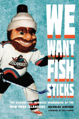
This logo was a drawing of a fisherman with an angry look dressed in a raincoat holding a hockey stick. Forgoing the traditional “NY” logo with a hockey stick forming the “Y” on top of a map of Long Island, the Islanders were looking to market such a logo and mascot to younger fans. They even hired a young man to appear in a costume resembling the fisherman as a mascot during the team’s home games.
What they didn’t count on was the backlash the team would receive from the fans and the media about the new logo. Islander fans were upset about the removal of the old logo and the connection they felt it had with the team’s glory days. The media was unrelenting with its criticism and sarcastic barbs about the new logo, comparing it to the mascot of the Gorton’s frozen food company. Gorton’s is most noted for its frozen seafood, including fish sticks. That lead to the derisive chant by opposing fans “We Want Fish Sticks!” Naturally, that chant was started by Rangers fans the first time the Islanders played in Madison Square Garden wearing the new uniform.
This was just the beginning of a long two years in which the team posted the third-worst combined record in the league. There was plenty of controversy in the front office when general manager Don Maloney was fired in December 1995 and Mike Milbury was named the general manager. While Maloney was believed to have been too inexperienced to have made good player personnel decisions, Milbury’s moves were also questioned despite having had experience with the Boston Bruins. To further muddy the situation, Milbury also named himself head coach in 1995 and had tumultuous relations with many of the players.
Speaking of players, the book has plenty of information on their role for the Islanders’ woes during these seasons. The author talks about the players who were supposed to be key contributors to the success of the team and why they fell short. Anything from injury (Brent Lindros) to lack of promotion of good players (Ziggy Palffy) to the player just not wanting to play for the team (Kirk Muller). Readers who want to read more about the action on the ice instead of just about the front office or marketing will also enjoy this book.
It should also be noted that during the end of the “fisherman era” (as the author calls this time frame repeatedly through the book), the club had one more embarrassment in the front office. Desparate to be rid of the Gang of Four, the fans and media were excited when a potential buyer of the team was announced in 1996. John Spano, a Dallas resident who had connections to Long Island, was going to not only purchase the team but was going to invest in the required upgrades to the arena and acquire players to bring a championship back to Long Island. However, investigation revealed that Spano’s fortune was non-existent as he had defaulted on several loans and eventually was convicted on charges of fraud. The euphoria that had briefly enveloped the team and its fans was quickly deflated as the era quietly came to an end when the Islanders went back to wearing the traditional logo on its jerseys to start the 1997-98 season.
One more note about the book is that it took an unusual action by providing the entire transcript of an interview with one of the key people in designing the uniform. Pat McDarby was the graphic designer whose sketches inspired the logo. Because McDarby died one year after the interview and his high profile in the sports branding business, it was decided to print the entire interview. This was one of the best add-ons to a book I have read as McDarby’s insight into what went into the logo and some of the possible reasons for its failure made for great reading, especially after reading the entire story in the body of the book.
For readers who are interested in sports branding as well as hockey history, this is a must read. I hesitate to recommend this to any Islander fans, unless they liked the fisherman logo, as it may bring back some painful memories of a short but painful era.
I wish to thank University of Nebraska Press for providing a copy of the book via NetGalley in exchange for an honest review.
Alexander K, Reviewer
I really do empathize with the design firm, the fans, the players and all affected by this rebrand!
I have a had some campaigns go south on me but never anything this big.
I read this book as a fan of marketing, I don't believe I've ever watched a complete hockey game in my life.
The storytelling in this book had me jumping to youtube to watch countless video's that sounded too crazy in print to be real.
From the onset, the manager's heart was in the wrong place. They saw other professional sports teams launch new character-based logos enjoy skyrocketing merch sales.
Then the design firm didn't research the fans expectations.
Followed by a very poor performing team.
This was the tale of how everything that could have gone wrong, went horribly wrong.
Marketing should not be used as a band-aid for a bad service/product/offer/anything.
One of the oldest marketing truths: Marketing will help a bad product fail faster.
At the same time, LA Kings rebranded successfully with a team that just welcomed #99 (who was timed perfectly to arrive with the new logo/colours). As was stated a few times in the book, they could have worn pink jerseys and the fans would have cheered; because the team/product was so good.
The NY Islanders had a different story. What could have been a successful brand was squashed by two of the teams worst years; both on the ice and in the office.
Add to the fact that they had been very successful in the past, ditching the logo of the successful years removed the connection fans had to any hope.
To wrap up--you do not need to be a fan of sports, hockey, or NY Islanders to really enjoy this book. It's a comical tale of the social struggles of communicating with passionate fans with several lessons to pull out the writing.
"People are treating the 'fisherman' logo like it's a swastika."
"Every professional sports team is a brand that tries to trigger loyalty among its fans in order to draw media coverage, attract lucrative sponsorships, and increase attendance, ratings, and merchandise sales. Through monikers, slogans, signs, symbols, and designs, sports brands identify teams and engender an emotional connection with the public."
I wish to thank the University of Nebraska Press for providing a copy of the book via NetGalley in exchange for an honest review.
Victoria C, Reviewer
Thanks to Netgalley and University of Nebraska Press for sharing this interesting book. I found it fascinating and funny, until I didn’t, and I did not finish the book. For the correct audience, I think it will be great. That audience is probably sports fans, specifically hockey and more specifically Islanders fans, and also those involved in marketing and specifically sports branding and marketing. Very enjoyable read until I got bored with the subject.
The 1990s marked a period of change for the NHL, driven partially by a growing push for merchandising. This new revenue stream proved lucrative, and teams tripped over themselves attempting to push their wares. What’s more, they discovered something peculiar: people would actually buy merchandise outside their local market— it just had to be cool. The San Jose Sharks. The Mighty Ducks of Anaheim. The Los Angeles Kings. Each of these teams tapped into the culture of the ‘90s, producing stylish and sleek designs by either completely rebranding or capitalizing on a Disney tie-in. For each, it proved a massive success.
Then the New York Islanders got into the game by slapping a fisherman mascot onto their jerseys.
Rarely are disasters so entertaining.
Author Nicholas Hirshon has painted a stunning portrait of perhaps the biggest misfire in sports branding. He delves into the minds of the owners, players, fans, and so many others in an attempt to piece together the backlash over a simple logo—beyond simply that it looked like the Gorton’s frozen fish sticks mascot. The personalities are huge, from the constantly attacked costumed mascot Nyisles to the many fans who balked at the switch from the classic design. Through countless interviews and deep research, Hirshon weaves their thoughts into a compelling narrative of the tumultuous couple of seasons in the mid-90s where everything seemed to go haywire for the Islanders.
But not everything can be blamed on a logo, and Hirshon taps further into the team’s problems. A losing season. A player who won’t play. A temperamental coach. A new owner who committed fraud to buy the team. These stories are detailed, providing a snippet of hockey’s inner-workings, while the design flaw lingers in the background—a fisherman standing over the chaos.
Remarkably, while this is a book about a very specific piece of hockey history, it remains completely accessible. Hirshon is specific enough to keep die-hard fans happy, but broad enough that most can follow. But then, anyone can appreciate a failure.
There are many great, interesting, too strange to be fiction stories in professional sports, but one of my favorites in the New York Islanders in the mid to late 90s. After watching the ESPN 30 for 30 documentary about John Spano acquiring part of the franchise due to fraud, I thought that this was an interesting story. "We Want Fish Sticks" is a different angle of the franchise throughout the same time span, and another aspect of a team struggling through a perfect storm of really bad decisions.
Nicholas Hirshon's book focuses on the relabeling of the New York Islanders franchise with new jerseys, new colors, a new mascot, and a new logo. They were following the lead of other successful West Coast teams like the LA Kings and the Anaheim Ducks, both of them with a very successful re-branding campaign. The problems with the Islanders uniform switch is that they had been a great team in the 80s, winning four straight Stanley Cup finals, and were now not as strong of a team as they were back then. The formula of losing season, a new volatile coach, and cheap management leads to a great, if not painful story. Reading it as someone who was not involved, is not an Islander fan, and is just interested in a great sports story, "We Want Fish Sticks" is everything a person can ask for. This is one of my favorite weird sports stories, and this book really adds to the almost sad quality of the late 90s New York Islanders.
I received an ARC from NetGalley in exchange for an honest review.
Readers who liked this book also liked:

Views expressed in promotions/advertisements do not necessarily reflect those of NetGalley or its affiliates.
© 2026 NetGalley LLC
• All Rights Reserved


Views expressed in promotions/advertisements do not necessarily reflect those of NetGalley or its affiliates.